Search

Tales From The Nib

Deacon’s Doodles.

Hi everyone,

I’m back with my latest review, and just for a change it’s a double, a fountain and ballpoint pen set.

It’s always lovely when you are asked to review something, and in no time pops through your door, I do love happy mail.

These pens are from http://www.mrpen.co.uk/ Although I have heard of the maufacturer, I’ve not actually looked.

Its always nice to find out more about a company, and first impressions are good.

The Italix Deacon’s Doodle looks great, I was impressed by the look of both pens, they certainly don’t look like what you would imagine given the price of these two pens when purchased separately, The fountain pen is just £14:99 and the Ballpoint pen retails at £12:95. The set can be purchased for £27:95 including the gift box.

Now we all know that the weight of a pen doesn’t equate to quality, some very expensive pens are lightweight and others are very heavy.

But the Italix is a nice weight, especially posted, it’s got a nice balance to it, same as the ball point, weighing in at 30g and 13.6cms long.

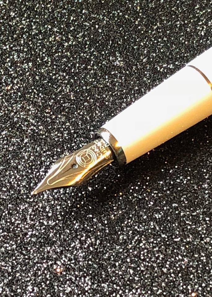
The fountain pen has a steel nib, which is pretty nice especially considering the price tag.

It comes in medium, medium cursive, medium italic and medium oblique, left foot, so plenty of options for everyone, but I found the nib finer than a medium from say Parker,so that is something to bare in mind when considering your nib choice?

It has a click cap, something that could cause an issue for anyone carrying the fountain pen in bags, I personally prefer the screw caps, just incase the lid comes off, but I think if you were to use a pen case, you will be fine, as the cap clicks on well. but something to consider.

The Ballpoint pen is also a lovely weight around the same weight as the fountain pen, but slightly shorter at 13.3 cms long

The refills for the Ballpoint are the G2 Parker type, so easily purchased, even if you are doing your weekly shop, so it is a bonus that this company has made both types of refills accessable, other than only being able to purchase over the internet or pen store, so they really have thought about lots of things.

This pen set is available in steel, like this one, but also is available in black, which does look quite striking, and also both are availble personalised as Mr Pen do offer and engraving service using 3 different fonts, great if you are sending this as a gift to someone.

Both pens write really well, which is the most important factor for me, I don’t care for pens that I have to fight with, or play up when you are writing, it drives me crazy, I just want to write !

Now would I buy this set, I think I would, a few niggles about the push cap rather than a scew cap, and I personally would prefer a finer nib, but I think that is more personal preference, and no way a complaint.

But for a budget price pen, the quality is great, and the writing experience is a good one,

I do think that a more well known brand would be charging so much more for just the fountain pen, so its almost like you are getting a ballpoint pen for free in that respect.

I do think that I will have to investigate further in the Mr Pen website and branding, if this pen set is anything to go by, then I would really like to know what the rest of the pens are capable of.

Thank you to United Inkdom http://unitedinkdom.uk/ as always for the opportuniy to review another great pen.

Bye for Now

Sx

Cleo Skribent Classic Palladium Cartridge/Convertor Steel Nib Fountain Pen

Hello again everyone, I’m back doing a review for  United Inkdom, http://unitedinkdom.uk/ woohoo, it’s been a little while, but here I am.

This review is in conjunction with a fantastic pen shop, owned by John Hall, so I was tickled pink to be asked to review a product from somewhere I already knew about, but I promise that even though this shop is fabulous, I won’t let it cloud my judgement for reviewing this pen, if I hate it, I will just go to the shop in disguise, ha ha.

The shop is “Write Here” is Shrewsbury based, https://www.writeherekitenow.co.uk/ and here is a link to the pen…https://www.writeherekitenow.co.uk/cleo-skribent-classic-palladium-cartridge-convertor-steel-nib-fountain-pen.html .

I didn’t purchase this pen, it was sent to me to try, then return, but I was asked to write an honest and open review,  as many of you know I am a little bit of a pen and ink junky, but I will do my best to review this pen honestly.

23555214_10155795384718433_1018070394_o

The Cleo Skribent Classic Palladium with a steel nib takes either a convertor, which is supplied in the pen, or takes standard catridges, so you won’t have any issues finding lots of fantastic colours to use. You get a choice of 3 nib sizes, Fine, Medium and Broad, but I will be testing the medium for this review.

This pen retails at £75.00 inclusive of VAT, so not overly expensive, a great Birthday present maybe? Or your everyday writer.

The Cleo is stylish, as you can see my tester is white, which I really like, I have other white pens, it’s becoming a little bit of my thing…. But the pen is metal but covered in precious resin, Very posh, it sounds great. The cap is a screw on and the little silver accents are palladium coated.

23476915_10155795385308433_722525001_n

Right, let’s get this pen out of the box.

First and foremost, I like the look of the pen, I think the silver against the white lends itself well to it being called the Classic, it is, very classy looking, in fact I prefer the Palladium to the gold, sometimes the gold is too colourful, and can then look like a plating rather than a gold, but that’s just my opinion of course.

It’s not a heavy pen, much lighter than my TWSBI 580 AL, and has a nice balance when posted, it’s comfortable to hold, which is necessary with any pen usage.

I liked the fact that the converter is screwed in rather than a push in, those can have devastating consequences if you rush and you haven’t pushed it in correctly……. Ink…… everywhere….

23513134_10155795386548433_1781841985_n

The nib is pretty too, the engraving is perfect, not overly fussy, but I don’t tend to concentrate on nib design when I’m writing usually, although I have googled over nibs in the past, obviously not while I’m writing with it.23548296_10155795387168433_58646473_n

For this review, I didn’t want to write with it for a few days before writing a review, because there would be an attachment and I’d not give and out of the box opinion, a little like watching a tv show, you aren’t planning on watching it, but you become invested after the first few minutes ha ha.

The nib is firm with little bounce, you wouldn’t say this is a soft nib in any way, soft nibs bounce quite a lot, this doesn’t and I find that is great for everyday writing, so what I’m trying to say, you won’t get any shading from the nib, just nice flowing ink.

I like the fact you can feel a little feedback from nib to paper, it not buttery smooth, but again, I’m not a fan of writing on a cloud, I like to feel like I’m writing, so you can feel the nib on the paper, another tick from me there.

I could tell it is a brand new nib, but after a few lines I could feel the nib wanted to be written with, and started to adapt to my writing style, the more you write, the nicer it feels, it’s not a wet nib either, it’s quite dry when writing, but that’s a plus for me, I’m not fond of wet nibs, unless it’s a very dry ink of course, then it’s more acceptable. I also noticed that for a medium nib, it was quite fine, more like say a Sailor or Pilot medium nib in width on paper, but not as medium as a Parker or TWSBI, so that is something to bear in mind, if you want to experience a Cleo Skribent for yourself.

23549732_10155795385958433_167840722_n

You can probably guess from my review I like this fountain pen very much, from its classic looks to a great writing experience, it ticks all the boxes. It’s not going to break the bank, although it’s not a cheap and cheerful price, but I have pens similar price and more that I’ve used for many, many years, so it works out as pennies per usage, well that’s what I tell myself, or I just can’t resist a beautiful pen.

23548331_10155795567568433_1481563557_n

I guess the unanswered question is, would I buy this pen?

Yes I would, it writes well, looks great and doesn’t require a remortgage to buy it.

Many thanks to John “Write Here ” and to United Inkdom for a wonderful opportunity to review this pen, I had a blast.

Until next time.

Sx

The Punk Planner

Hi Everyone,

Well it’s been a little while, but I am back again to bring you stationery  goodie information.

Today I want to chat about a new company called “The Punk Planner” Thepunkplanner.etsy.com there are over 70 designs available so a great place for most if not all your planner needs.

Kimberley is an avid planner, and also loves all stationery from paper to inks, so I guess, it was quite apt that she went into the planner business.

The punk planner specialise in insert, planner charms, and accessories for ring, disc and TN’s, many variations on not only the inserts, but you can also have the stylish standard covers, a black leather, or a lovely marble, one off the custom designs, or why not ask for your own image?

But today I want to focus on the inserts.

The insets come beautifully finished and  use high quality bright white 90gsm paper, the bonus is that this paper is fountain pen friendly for many inks. Now obviously there will be certain inks that shadow, or bleed through most papers, or if you use a wet fountain pen that likes to lay down lots of ink, it might be different, But the ink I have tried work well, and for reference I am going to use medium nibs, from different pen manufacturers to keep it fair.

The inks I have used have all behaved very well, and are a joy to write with. I also have lightened every photograph as the weather isn’t very bright, so there is more ghosting than in reality.

I wanted to use quite dark colours to see what results I could get, and to give the paper a good test, I almost always write with fountain pens, so I wanted inserts that could take my demands and not have me cussing about ink bleeding through the page and spoiling the look of my planner……. People see them when you make appointments, so one needs to look immaculate making a planner entry, its the only time I am prim and proper, for sure.

First out of the starting blocks is one of my favourite inks. J. Herbin 1670 Stormy Grey.

I love that from a distance its grey almost black, but as the light reflects you get a gold shimmer, it’s just fab.

Not much glitter going on here because of my camera angles, but as you will know it does look great.

IMG_0014

I inked up my old Parker Frontier pen, and wrote on the pages from the “week on one page plus notes. The paper is lovely and smooth, but also gives a little feedback on the nib. I am not a huge fan of those buttery smooth nibs, I prefer to feel like the nib is actually on the paper, but thats just my opinion.

The ink lays down nicely and the 1670 DID NOT feather, it reacted nicely from the front view ( see the little image in the bottom corner for the front view ) and on the reverse you can see its not any more prominent than most inks would be.

I laid the paper down onto white paper underneath, so you could see any shadowing more than while laying in your book, as I didn’t want to hide a thing.

Next in line for an inking was the Sailor Pro Gear Slim, with the beautiful Kiri-Same ink, a lovely mid grey with a warm tinge, rather than a cooler toned grey, it is fast becoming another of my favourites.

IMG_0013

It’s quite a dry ink in my opinion, so I expected it to behave really well, and it didn’t disappoint. It layed down really well, again, not a feather in sight, and had minimal ghosting and absolutely no bleed through, a dream on this paper,  would be interested to try this with a broad nib at some point. This ink is fast becoming my favourite planner in…. well until I get another favourite ha ha.

I then moved onto my Nemosine Singularity again with a medium nib, its rather a chucky nib for a medium, but writes quite nicely.

I decided to push the limits by using Diamine Onyx Black, Black ink is notorious for bleeding… right ?

IMG_0018

Ermmmm, nope, again, no feathering, laid down nicely, and didn’t really give me much trouble on the reverse, You can see the most ghosting, but I expected much worse from a dark ink. In truth I am pretty pleased with the back of the insert, and would use it again. Ok, I am not a black ink kind of person, but if the fancy took me, I know that I can use black if I choose to.

Ok, now for those who haven’t fell asleep yet, or got bored and gone fishing, let move onto the next experiment.

The TWSBI Eco, yet again a medium nib, (I did tell you earlier I was going to use mediums didn’t I?) filled to the brim with Diamine Prussian Blue. I wasn’t to fond of the colour at first, but it dries a beautiful Blue/Grey, and is really quite lovely.

IMG_0019

At the risk of sounding like a broken record, but yet again no feathering, and it lays down incredibly smoothly, its a hidden gem of an ink, and I am very grateful for being gifted this ink. A little ghosting on the revrse side, but really its only visible when tilted more towards the light to reflect through the paper.

Next up… enter Shaeffer Prelude stage left Diamine Damson, a beautiful… well colour of damsons ha ha. A very nice colour and ink to write with.

IMG_0017

I did wonder if this would feather, or you would see it feather more, but no, it dries lovely and has hardly any ghosting on the reverse, I also found the paper hasn’t warped while the ink dries with any of the above inks either. They have all so far behaved extremly well.

For my final test, I inked up my Parker Sonnet with Rohrer Klingner Alt Goldgrun, apologies if that isn’t spelt correctly.

IMG_0016

I found this to be wet, it curled the paper and took a while for the paper to return back to its normal state, there was the tiniest bit of feathering, but considering how wet it laid down I was expecting much worse results. for such a mid toned ink there was ghosting, not really terrible, but I felt that it was worse in some respects than the black ink.

I had a creative accident and splodged my ink onto the inserts ( won’t be adding that part to my planner now 😦 ) but it gave me another photographic opportunity to show you how nice this paper is.

IMG_0015 
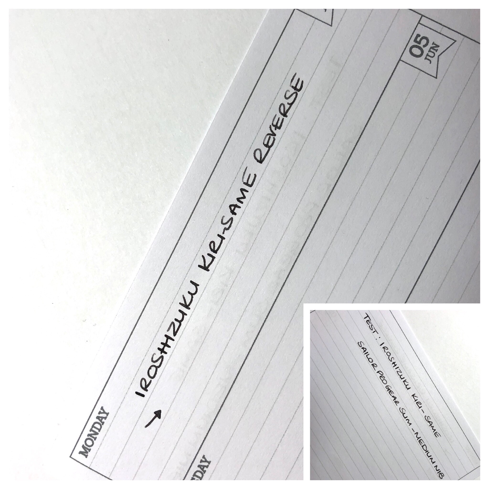
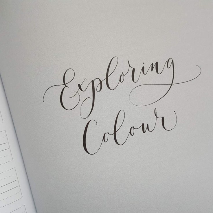
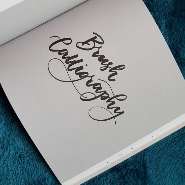
… Whoops….. but from the photo you can see that this paper does actually take a fair bit of ink before there are issues, especially if you are more careful than I am, and can’t be left unsupervised by an adult ha ha.

But it does give you some idea about the paper, and how lovely the inserts are.

Yes, there will be some ink somewhere that will bleed through this paper, but for the most part, I enjoyed the experiment, and found the paper super for my uses.

I really like the inserts, they perform well when writing in fountain pen ink, look crisp and white, fab designs and rather importantly affordable.

If you are looking for inserts, pages or planner dashboards, vellums and anything else, then check out Kimberley’s shop on Etsy. www.thepunkplanner.etsy.com

Until next time, Take care

S x

Modern Calligraphy

Hi everyone,
I’ve been busy recently but wanted to introduce you to a new book that United Inkdom asked me to review.
This newly released book is published by “The Orion Publishing Group” www.workbooks.co.uk  Priced at £12:99

20030991_10155455856418433_99745871_n
Its a step-by-step guide to mastering modern calligraphy and written by the founder of “Quill London” Lucy Edmonds, she also runs modern calligraphy workshops in London. http://www.quilllondon.com
Anyway let’s get started…
This book is beautifully presented, with a rose gold gliding effect on the front cover, it’s not overly busy, more of a classic design, but very nicely designed. This book is aimed at beginners, and for people who would like to start their journey into modern calligraphy.

20120776_10155455857988433_1277411677_n

I’m more of a traditional calligraphy kind of girl, and love engrossers script and copperplate, but who knows I might start another path down the modern calligraphy route, for fun projects.
This book covers most of the basics, like listing nibs, paper and inks.

20031113_10155455858873433_1099333045_n

It also goes into various nibs and how each one behaves and there flexibility, preparing nibs for use, the list goes on.

20045875_10155455859688433_2116697937_n

In the exercise section you are taught how to produce heavy down strokes and light up strokes, with examples of good and bad strokes, with tips at the side lines of the book too.
And throughout the book, there are lots of dotted and lined practice sheets.


I’ve not written in the book, so I’m not sure how the paper reacts to inks, nor as to if it feathers, for me personally I never write in calligraphy books even though the paper is there for that purpose. Later in the book, there is a chapter on exploring colour, colour theory and different inks, including watercolour and metallic inks.

19989202_10155455862583433_1510564300_n

I remember searching the internet to find information about using watercolour, and which ones were ok to use with dip pens, I was clueless, so that’s a handy section that has been added. This book covers brush calligraphy too, not this is something I’ve never tried personally, I much prefer nibs and ink, but know many who do love to combine modern calligraphy and brush pens with amazing results.

20030811_10155455861358433_2041559385_n

This book really does cover many aspects of calligraphy, fake calligraphy and also has some super projects too. The envelope section is particularly useful, who doesn’t love a pretty envelope being popped through the door by the postman, someone taking the time to send you pretty snail mail is just wonderful.


I hope that you’ve enjoyed the review as much as I enjoyed it.

Stay tuned, I will be back with experiments and photographs of the outcome of my practice sessions using this book.

Until next time x

Robert Oster Signature inks

Hi everyone…

Well my first review of 2017, and courtesy of Roy from Izods, Roy and the United kingdom team http://unitedinkdom.uk/ sent me two samples of Robert Oster Signature ink to test out and give my thoughts, good and bad……

The ink samples I received were 2 from the 9 inks in the range, that can be purchased in the UK, from Izods, http://izods.ink/ mine are Summer Storm and Emerald. Robert, the creator of these inks is from the Limestone Coast Australia, and makes the inks by hand, with his team. They did a great job on the ink and also the designing of the branding too.

16129888_10154880379173433_4967768_o

Summer Storm is a delightful blue grey colour, which goes perfectly with its name.
It struck me that this would be a great alternative for formal type letters, different than your run of the mill blacks and blues, which have a place in the world, but I personally don’t write with them often.

16121501_10154880390218433_1105748088_o

I still write to friends via snail mail, and I have visions of the postal service employees being blinded by some of the inks I choose, I mean can you imagine the postie falling over a garden fence after making his or her eyes go squiffy trying to read an address ????.
But I think it would be a nice colour to write on envelopes and packages, and way more conservative than most of my choices.
The Robert Oster Signature inks are wet inks, so they are quite juicy, great for wet pens,that like lots of flow.

16130142_10154880380883433_1090550763_o

The colour variations are great too, I love how the fade with up and down strokes of the nib, it gives such an interesting effect on the paper, rather than being a solid even colour.
The inks flow well through the nib, I used a Jinhao X750 and my dip pens for this review, and it worked very well with that medium nib likewise the dip pen nibs. No dry spots, or burping of ink through the page.

Although the ink is quite wet, the unique mixture used to make the inks, worked wonderfully, and I didn’t have lots of feathering, it worked extremely well on 120g printer paper, although you might get a different result on the paper of your choice ?

The second ink I had the pleasure of reviewing was the Emerald, a beautifully rich emerald green.

16145834_10154880385213433_466900479_o

The colour variations again is very pleasing, from a dark emerald to a beautiful mid green with the nib strokes.

Again the Emerald is a wet ink, so would be really wonderful in stub nibs, the wider the nib, the more obvious the ink variations would be. It’s a nice green, quite conservative like the summer storm, and a pleasant colour for every day penmanship should you so wish.

16145180_10154880382763433_377934221_o

The signature inks retail at £14:95 but you do get 50ml of ink for your money, and if like me, you love dip pens too, then you can pour a little into another dinky jar and add some gum arabic to thicken for use in calligraphy, so you are halving the value of the initial price, if you want to.

16129199_10154880386868433_2065013362_o

I think that the Robert Oster Signature inks are lovely inks to write with, and I’m really sitting on my hands to stop myself from buying a few colours, top of my list would definitely be Summer Storm, I’m in love with that one in particular.

So until next time, take care…

Sarah x

Diamine Shimmer Inks

Hi everyone,
I recently received some new inks to review, yeah I know, I’m very lucky to be able to review awesomeness for  http://unitedinkdom.uk/
Well today, I bring to you, Diamine Shimmer inks, a range of 10 shimmery inks, that are fountain pen safe.
I remember as a child killing a fountain pen, by adding glitter to a fountain pen, needless to say I killed it. It was never the same after that…. Anyway, I got to test 3 of the range, and had fun playing, I do love glitter.
My first was the Diamine Shimmer “Moon Dust”.15398859_10154722036783433_1114346451_o
A grey black with silver shimmer, the ink was a nice consistency, and flowed well, surprisingly no stop start with ink flow. Some inks are very dry, but this was totally fine.
I noticed that the ink looked quite dark, but seemed to lighten slightly and as it dried you could see the glitter appear.
It’s a great colour if you are slightly nervous of walking on the wild side, a classy tone, that’s not overly in your face.

15327598_10154722043693433_1369895743_n
I much prefer to write with a dark grey, than a black ink, so this is a nice sophisticated colour, that would look lovely for writing notes, envelopes and letters.

15357005_10154722034683433_506551130_n

My second ink I reviewed “Diamine Magenta Flash” , a lovely pinky/purple, with silver shimmer.

This is such a great colour, one of my favourites, I do like pinks and purples, not your usual ink colour to write with……Well unless you are me, then totally acceptable ha ha.

15310276_10154722040613433_141936792_n

Again it flowed well, and I found again the glitter appeared afterwards, but a beautiful shade, and quietly classy.

15403008_10154722045763433_1409844165_n

Personally with the bright ones, I’d of gone even more apparent with the glitter ha ha, but still a nice ink.

15401201_10154722033163433_1245048254_n

My third ink review was “Diamine Pink Glitz” this had all the same qualities as the previous two, but this has a gold shimmer.

15369820_10154722037683433_1851649583_o

A pretty bright pink, that would look super for birthday cards and such like, especially for any pink princesses you get to write too.

15310485_10154722048068433_91912995_n
The pink, has an orange tinge, in reality, this is not the case, it is PINK I promise haha.

it also made my eyes google trying to take this photo, can you tell ???.

15403237_10154722031748433_89965205_n

I must admit, the brighter colours are very strong pigments, so I didn’t leave them in my fountain pens for too long, I was aware of the glitter possibly clogging the feed, and also didn’t want my converters strained, but I’m probably being a “Diva”, so decided to be cautious. I also found that the ink didn’t work so well on certain papers, it feathered and bled through, even using a fine nib, so I went on to do my review writing on Tomoe River paper, and it worked fine.

I went on to experiment with the inks, I added some of each colour to little empty ink jars, added a little gum arabic, to thicken the ink. The gum arabic made the ink a nice consistency to use with dip pens too. So if you like fountain pens and dip pens, you could save some money, buy using the ink for both, which is a bonus.

15399015_10154722968583433_438503071_o

The Diamine inks are available in 50ml bottles and are around the £9:95 price bracket, from most pen retailers, and also from Diamine themselves.

So my round up to this review is, they are pretty inks, dual purpose, for fountain pens and dip pens.

They stain a little if you leave them in your pens for extended periods, and will bleed and feather on certain papers, but I think you’ll find that issue with most inks.

All in all pretty cool inks, and was very excited to be able to have a play with them.

I will add that the glitter swatches, were on a large area, so look very glittery, obviously the inks when you write with them, don’t have as much glitter, its much more subtle, than in the photograph.
My  wish would be, more glitter, you can never have too much sparkle ha ha.

Until next time 🙂

Nib & Ink Book

Hey everyone,
Today I bring to you a review of a new book, For United Inkdom  http://unitedinkdom.uk/ how exciting.

I received a parcel, (now you know I love getting parcels ha ha), from “The Book Service LTD” to review a Calligraphy book, “Nib & Ink” The New Art of Modern Calligraphy written by Chiara Perano. Here is the ISBN 978-0-75355-728-0. Just in case you want to purchase your own copy.

Okay, let’s get started, the front cover is beautiful, not overly busy or fussy, straight to the point, and classy in design, really well thought out, so you can see what the book will entail. I really like it.

15050432_10154650139798433_1799791246_n

This book covers so many aspects of modern calligraphy, and also I think would be beneficial for anyone wanting to improve their handwriting, or who wants to learn cursive.
From a newbie point of view, many books are available on the market, that can leave you with more questions than answers, (well that’s my opinion only, of course).

But the book tells you about various nibs for pointed pen calligraphy, and also offers many tips on nib placement, and suggestions of what might work for you.

15033742_10154650149178433_460516381_n

The book also offers a website link, for downloading practice sheets, and more suggestions of different types of paper too. Something that I had to find out for myself,when I started, it was just trial and error, and many, many mistakes, eeeekkkkk.

This book really does cover so much, it’s amazing how much the author packs into it.
Things like holding your pen, how much ink do you put onto the nib, calligraphy drills, the list goes on.

15051908_10154650164313433_2022261779_o

What I really like about the book, is the practice sheets, in a lighter shade, Chiara writes the letter, so it’s visible while you are practicing, and each page has a new letter.

What’s also lovely is each letter you can choose a style, so a few samples of the letter “A” and so on, in the picture below you see a page showing various ‘S’s, along with a full alphabet, there is also numbers and symbols too.

15058757_10154650153448433_1768673389_n

Going through the book, there are different greetings and quotes for you to use, perfect for cards for any occasion.

15064913_10154650155998433_1755508037_o

There really is so much packed into this little gem of a book, you can make gift tags, place settings, and in the tail end of the book there are projects to do, I can’t begin to tell you the fun things I plan on making, with inspiration from this book, it’s really super, and I think with the season of good will approaching, it would make a seriously great stocking filler for anyone of any age.

15032497_10154650159323433_674899027_n

I really tried to be objective with this book, but it’s just not happening, I think it’s awesome,it’s an informative book, with lots of helpful tips, and packed full of inspiration.

15050142_10154650145893433_1746716519_n

Such a fabulous and helpful book, I really did enjoy reading it, and will most definitely be trying some of the ideas.

15049886_10154650135468433_270612159_n

Until next time…………..Have fun

Sarah x

Steam Punk Glass Dip Pen

Hey everyone,
Today I thought I just have to write a review on my latest dip pen.
Now this isn’t just any old dip pen, it’s one of Steam Punk Glass’ creations.
Glen Godden, the owner and creator of not only dip pen holders, but all manner of wonderful glass gifts from a product called Borosilicate which I believe is a term more commonly known as Pyrex. Check out his website for the professional expert terms, just to make sure I have that right.

www.steampunkglass.com

The dip pen arrived promptly, the Steam Punk Glass service is first rate, shipment is of lightening speed, and let’s face it, if you are like me, I order and want my parcel straight away, I’m usually far to excited to wait days for things to arrive. I want to see it.
It arrives not only fast, but in its own presentation box, nice touch I think, plus it’s a pretty box too.
Then here comes to good bit, opening the box……

14813523_10154585331683433_1475101089_n

I can never contain my excitement, every parcel is like Christmas, I love getting parcels.
I peek into the box, and there it sits, pure beauty. Check it out, it comes with a nib, plus you can also order extra nibs too.

What is this sorcery…


It’s magical how the glass is sculpted and manipulated into shapes, the blue wave pattern reminds me of visiting the seaside as a child, and the pen sits beautifully into my hand, the barrel isn’t too large at the nib end.

14801125_10154585333403433_1711251434_n

All the pens are unique, not only the colour, but the shape too, each is blown separately, so you can see that each takes on its own appearance and characteristics.

14813151_10154585337333433_372258560_o

As you can see from the photographs, mine came accompanied with the Leonardt Blue nib, perfect for copperplate, Spencer’s fans which is easy to change, but the great part, the silver mechanism, which hold the nib can also be removed for cleaning and replacing too. Guess what ? Glen sells the Furrels too, so no searching to buy more, or importing them and waiting forever, did I tell you I hate waiting for things to arrive….ha ha.

14793794_10154585334898433_482550234_n

It’s very hard to stop writing about the dip pen holder, I could talk forever, but seriously, if you want a gift for a pen fanatic, or for yourself, that’s unique, elegant, works well, is comfortable to use and great value, then look no further, take a trip over to Steam Punk Glass, even better you could see all the beautiful products at Covent Gardens Apple market (drop him an email for the days he’s there, so you aren’t disappointed).

14799905_10154585348503433_67407059_o

www.SteamPunkGlass.etsy.com

14803127_10154585338133433_120831961_o

Until next time…

Sarah 🙂

Blog at WordPress.com.

Up ↑